


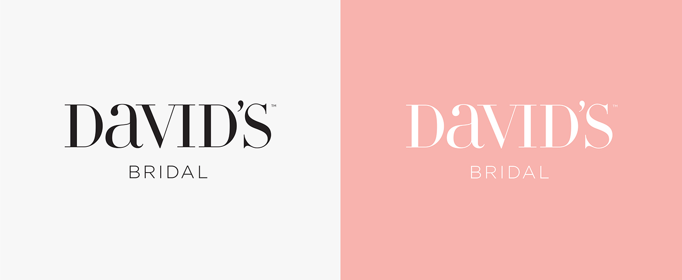
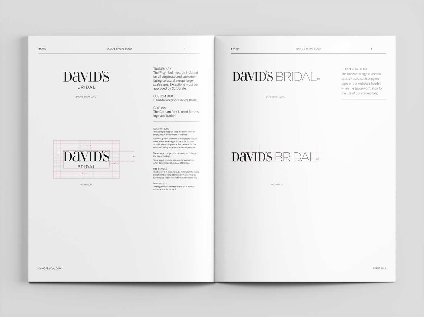
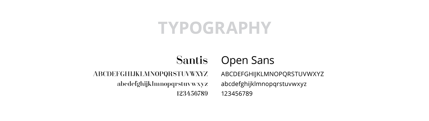
In 2014, we designed a sleeker, more sophisticated new logo for David’s. A fresh typography system followed
the logo’s unveiling, with easy-to-read headline and body typefaces (Santis, Open Sans) taking the place
of dated lettering.


Previous Storefront
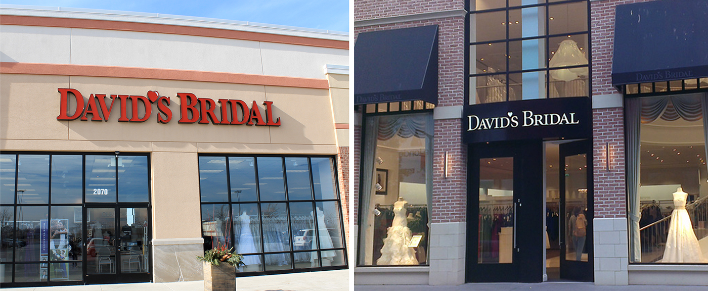
Updated Storefront


